Reality TV Show Predictor Dashboard - Sewing Bee
A compact, cutoff-aware dashboard that models who is most at risk of elimination next and who is most likely to win — built on The Great British Sewing Bee as a stepping stone to a richer MasterChef Australia project.
Overview
Reality-competition shows aren’t random: week by week, contestants build (or lose) momentum, and the edit reinforces clear story arcs. There are also thriving “bet on anything” markets where odds shift in real time based on public perception. Put those together with the fact that episode-level results are widely available (e.g., Wikipedia), and you have a great applied-analytics problem:
Can we quantify those arcs early enough to predict who’s at risk next week and who’s likely to win?
This project is my answer. I started with The Great British Sewing Bee because the format is clean (two ranked challenges + Garment of the Week + one elimination), where I built:
- A robust data model (contestants, episodes, per-episode performance),
- Cutoff-aware feature engineering (rolling form, cumulative wins) that avoids leakage,
- Simple, explainable classification models for elimination and for the eventual winner,
- An interactive dashboard that makes the reasoning transparent (trend lines, overlaps, leaderboards).
The broader motive is to show how structured data + careful modeling can turn noisy weekly narratives into actionable probabilities—exactly the kind of end-to-end thinking I bring to product analytics and ML.
Why start with Sewing Bee?
MasterChef Australia is complex (immunity cooks, pressure tests, team challenges, returning contestants, judge regime changes). Sewing Bee has a simpler, stable structure:
- Two ranked challenges per episode (Pattern, Transformation)
- One Garment of the Week (GoTW) (Best Garment made that episode)
- Typically one elimination per episode
That makes it ideal to validate the data model, feature engineering, prediction setup, and dashboard UX before scaling to MasterChef Australia.
What the app does
- Episode cutoff slider — see predictions as of any week (no spoilers beyond the cutoff).
- Next-episode elimination risk — Random Forest trained on history
< cutoff, with a safe heuristic fallback. - Win likelihood — Logistic Regression on season-to-date aggregates; eliminated contestants are excluded and treated as 0% by rule.
- Interactive visuals — compact Plotly charts with consistent colors per contestant.
Data model (Excel, 3 sheets)
- contestants:
series,contestant_id,name,final_rank(1 = winner) - episodes:
series,episode_id,episode_number,air_date,theme - performances (one row per contestant×episode):
series,episode_id,contestant_id,
pattern_rank,transformation_rank,garment_of_the_week(0/1),eliminated(0/1)
Source: Wikipedia episode pages
Feature engineering (cutoff-aware)
Per contestant & episode:
- Numeric coercion + median imputation by series for ranks
- Rolling form:
ma3_pattern_rank,ma3_transformation_rank,ma3_overall(mean of the two) - Cumulative:
cumu_gotw,episodes_survived - Target for elimination model:
eliminated_next_ep(lead ofeliminatedwithin contestant)
Aggregates up to the cutoff:
episodes_seen,mean_pattern,mean_transform,gotw(GoTW total)
Leakage guards
- Train on episodes before the cutoff, score at the cutoff
- Exclude contestants already eliminated at the cutoff from both prediction charts
- Force
win_prob = 0for eliminated contestants
Models
Elimination (next episode)
RandomForestClassifier(balanced)- Features at cutoff (latest row):
pattern_rank,transformation_rank,garment_of_the_week,
episodes_survived,cumu_gotw,ma3_pattern_rank,ma3_transformation_rank - Fallback if data too thin: risk ≈ average percentile rank of MA3s
Winner (season)
LogisticRegression+StandardScaler(balanced)- Features (aggregates ≤ cutoff):
episodes_seen,mean_pattern,mean_transform,gotw - Label from
final_rank == 1 - Fallback if labels unavailable: normalized score
s = -mean_pattern - mean_transform + 0.5 * gotw
Dashboard tour
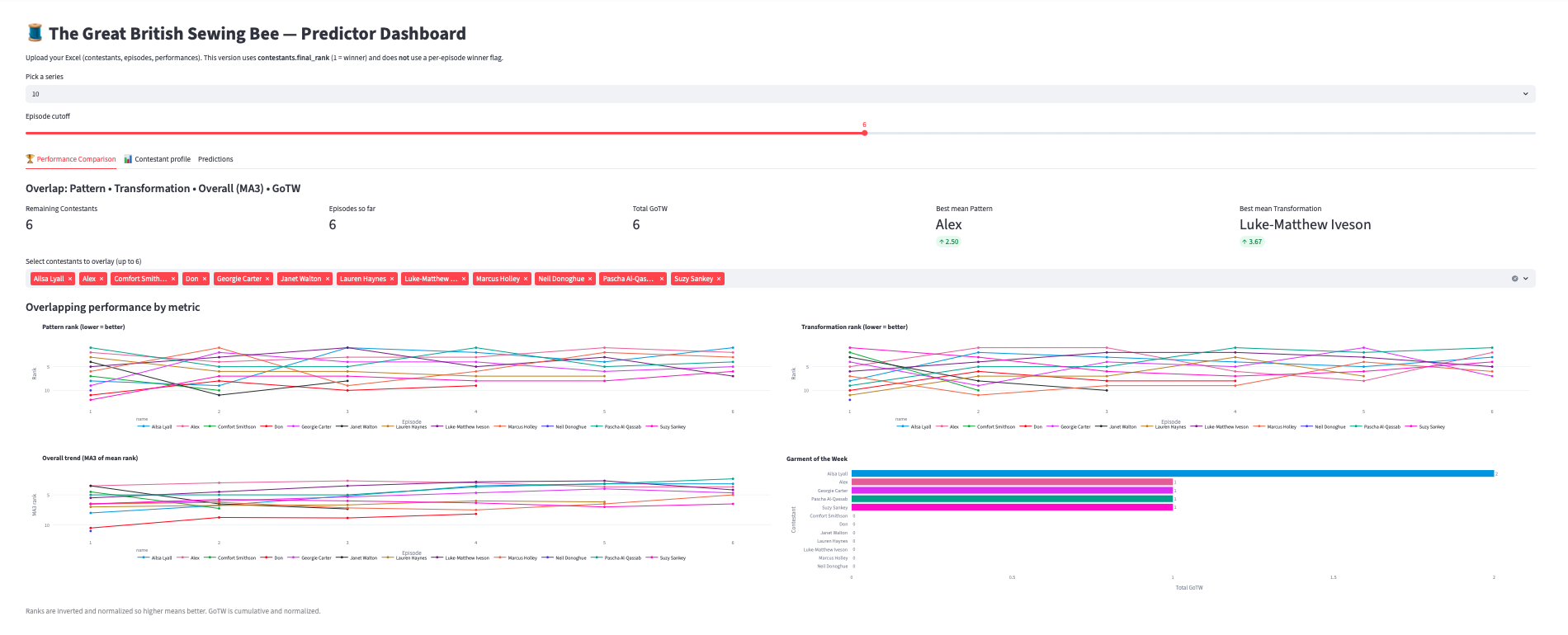
1) Performance Metrics
Overlapping lines by contestant:
- Pattern rank, Transformation rank (lower = better)
- Overall trend (MA3), GoTW totals (bars)
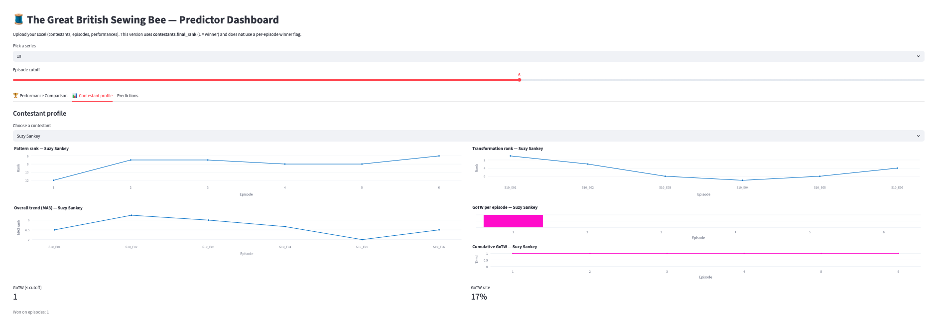
2) Contestant Profile
- KPI total GoTW + GoTW rate
- Mini timeline (per-episode win = 1/0)
- Cumulative GoTW (step)
- Pattern / Transformation / MA3 trends
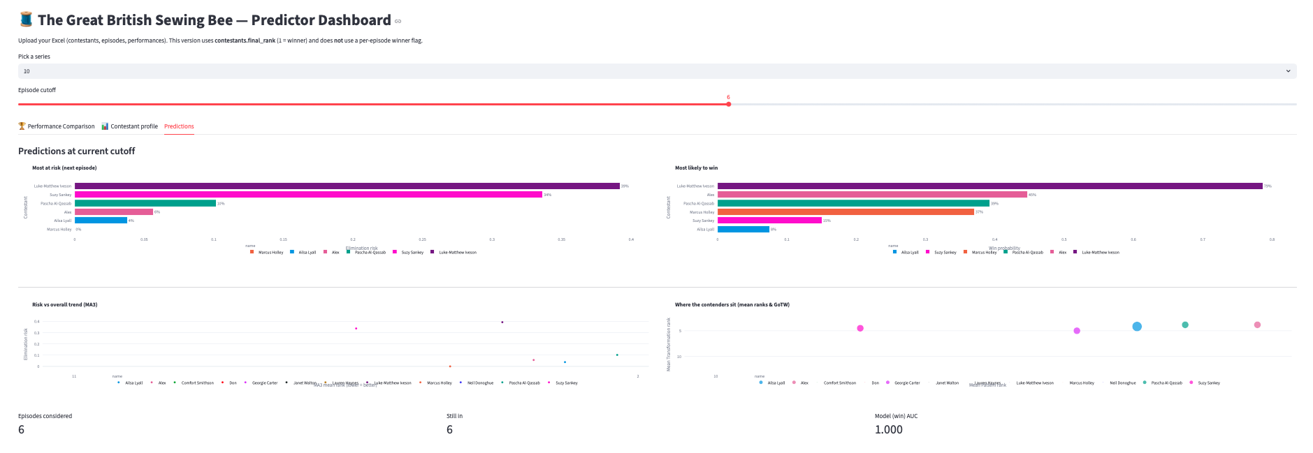
3) Predictions
- Elimination risk (top 8 alive contestants)
- Win likelihood (top 8 alive)
- Risk vs MA3 overall (lower MA3 → higher risk)
- Contenders map (mean ranks with bubble size = GoTW)
What this says about “the edit”
Even without screen-time or sentiment, performance arcs narrow the field by mid-season. In practice you’ll see the winner model concentrate probability on 1–2 names early.
For MasterChef, the next iteration will add:
- Challenge taxonomy (immunity / pressure / team) and per-type skill features
- Returning contestants metadata (previous best rank, specialty)
- Judge regime indicators (original vs later panels)
- Optional edit signals (mentions, recap tone, confessionals) as a separate, auditable layer
Validation plan
- Weekly backtests per season (AUC and top-k hit rate vs week number)
- Calibration plots for winner probabilities
- Ablations: performance-only vs performance+edit
Ethics
- Cutoff-aware to avoid spoilers
- Edit features can encode bias — keep them optional and explainable
Tech stack
- Streamlit + Plotly (interactive, compact mini-charts; consistent color mapping)
- pandas / numpy for transforms; scikit-learn for models
- openpyxl for Excel I/O